darabi dermatology
OVERVIEW
A research-led redesign for a triple board-certified dermatology practice, turning a credible clinic with a self-competing website into a clear, trustworthy path from "I have a concern" to "I have an appointment."
At OmniFlow Digital, I led the UX & conversion side of the practice's growth engagement: a full UX/CRO audit, a design system built from scratch, and redesigns of the highest-leverage pages. My job was to make the single most valuable action on it, booking an appointment, impossible to miss.
Discipline
UX Strategy
CRO Audit
Responsive Web Design
Design Systems
tools
Figma
Google Suite
Google Analytics
Lighthouse
ROLE
UX Strategist & Designer

APPROACH
HOW THIS EVALUATION WAS CONDUCTED
Jakob Nielsen’s 10 Usability Heuristics
Industry-standard principles used to evaluate usability, clarity, and interaction quality.
WCAG 2.1 AA Accessibility Guidelines
Industry-standard criteria used to evaluate color contrast, keyboard access, content structure, and assistive-technology support.
Manual UX & CRO walkthrough
Hands-on review of key user paths to identify friction, confusion, and conversion blockers.
Desktop (+1440px) + Mobile (+390px) testing
Testing across common screen sizes to reflect real user behavior on both desktop and mobile.
PROBLEM
when everything is primary, nothing is
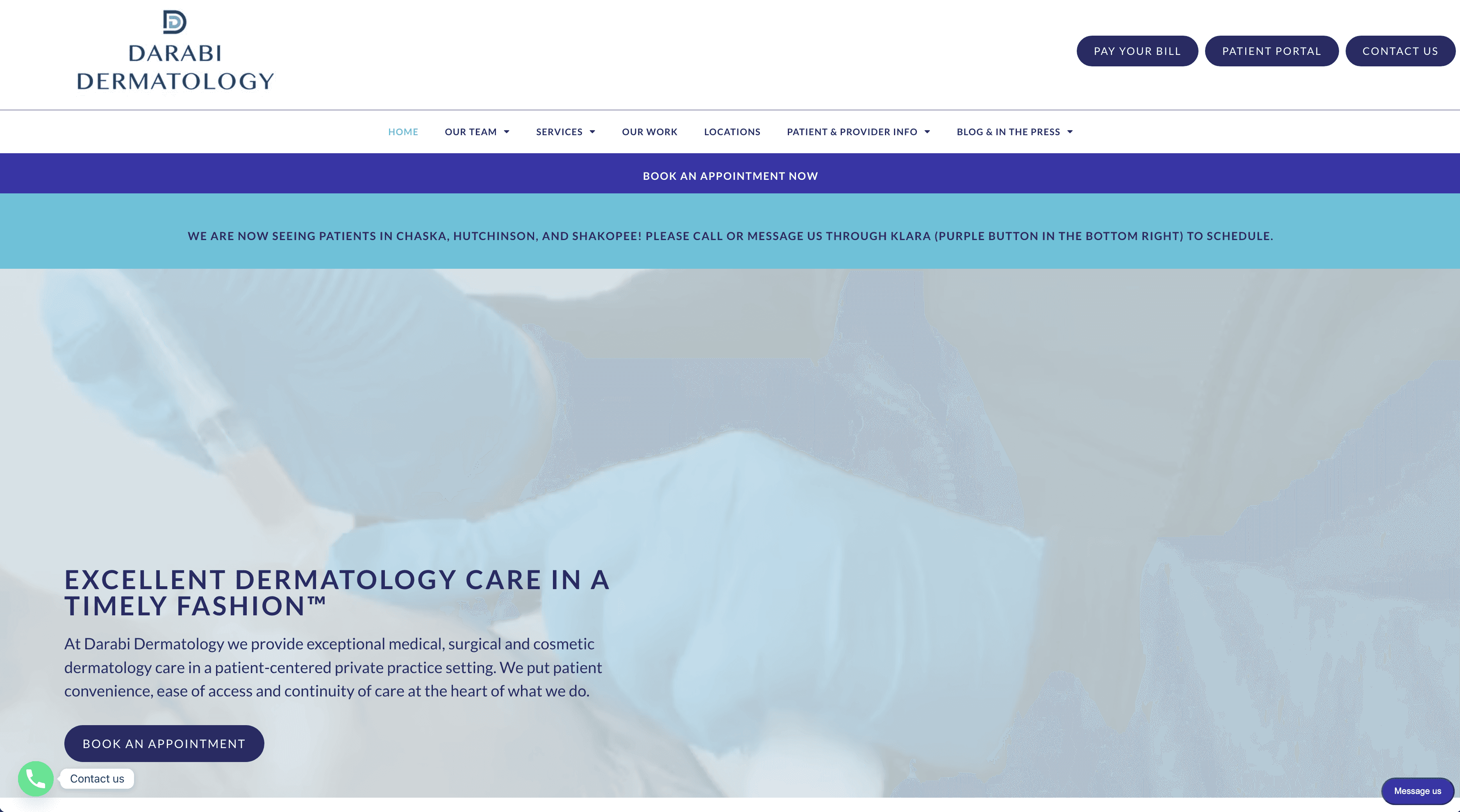
A first-time visitor with a suspicious mole had to decide how to decide before they could act. I framed the whole engagement around one question: what is the single next step we want a worried patient to take, and is everything on the page serving it?

Findings That Drove the Redesign
DENSE, UNSCANNABLE, LOW HIERARCHY
These five issues did the most damage to the booking path:
Solution I · Design System
One source of truth
I built a lightweight design system out of what already belonged to Darabi, primarily anchored by the turquoise that lives in their logo and enforcing cohesion through type, the audit found missing sitewide.
The key call was restraint, not replacement.

COLOR
Turquoise stayed because it's brand equity, but it was demoted from a competing text/button color (where it failed contrast) to a controlled accent. Purple was removed.
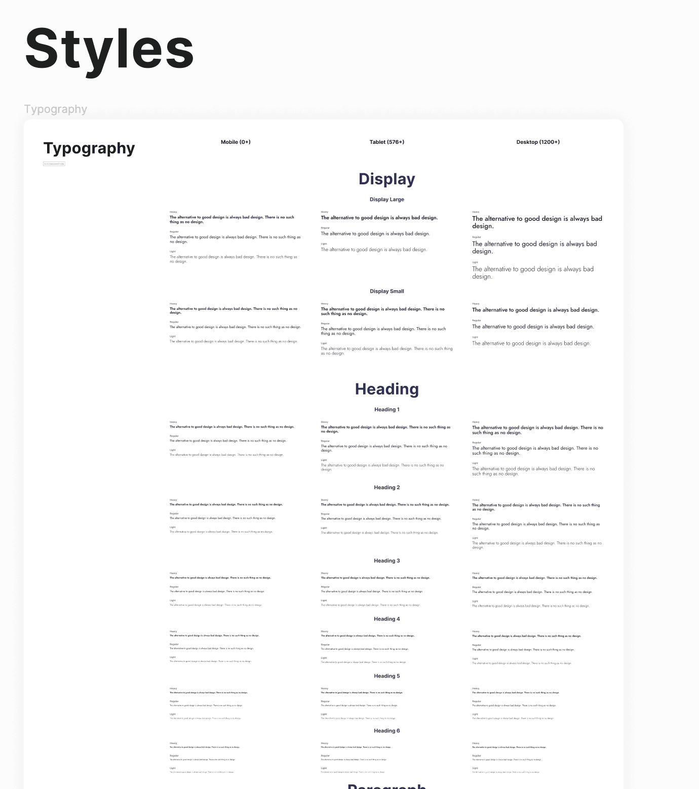
TYPE
The typographic scale, specified responsively so hierarchy holds from 390px to 1440px. A three-tier display scale and six heading levels.
BUTTONS
Buttons became a tiered primary/secondary/tertiary set, so the "one primary action" principle from the audit was enforced by the system itself.
Solution II · Homepage
A single, obvious CALL-TO-ACTION
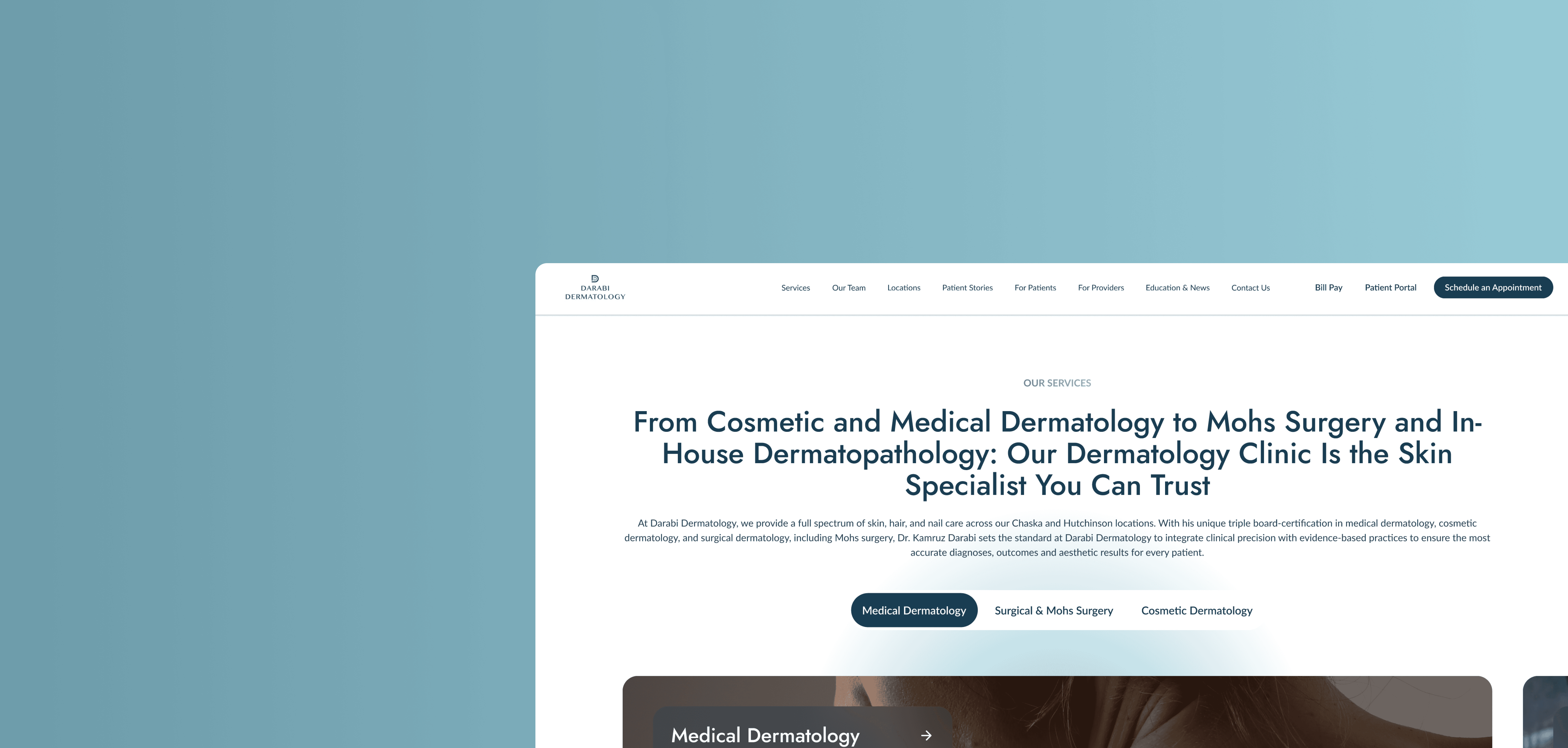
There is now one primary CTA carried in a persistent header and echoed at decision points down the page. Returning-patient utilities (Bill Pay, Patient Portal) become less emphasized: present for those who need them, but deprioritized to those who don't.
↕ Scroll to explore the full redesigned homepage
The Service Page TEMPLATE
↕ Scroll to explore the full redesigned homepage
When "show the work" becomes "show too much."
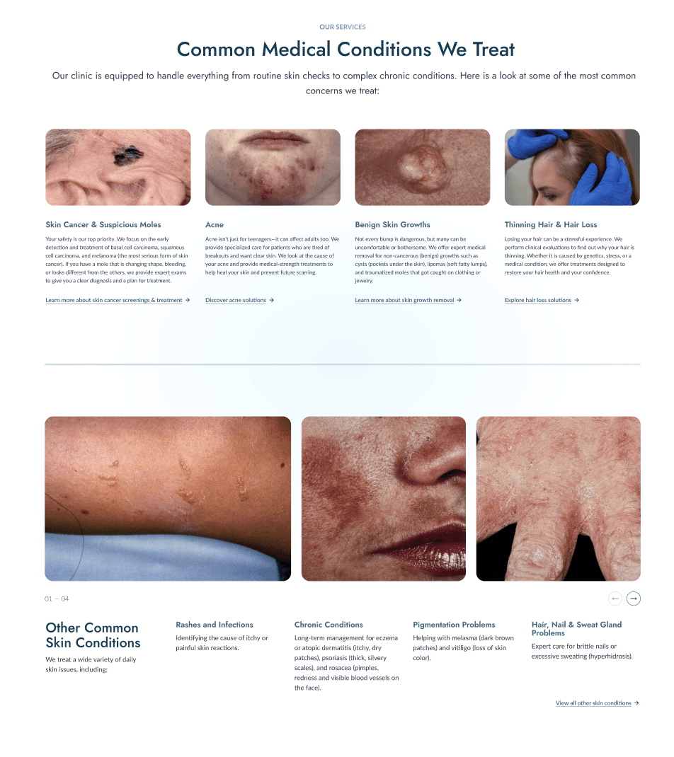
The medical service page had to do something delicate: prove the practice can treat a wide range of conditions without overwhelming an already-anxious patient. The "Common Medical Conditions We Treat" section became a design problem.
ITERATION
An earlier iteration: enlarged clinical close-ups. Accurate, but feels uncomfortable.
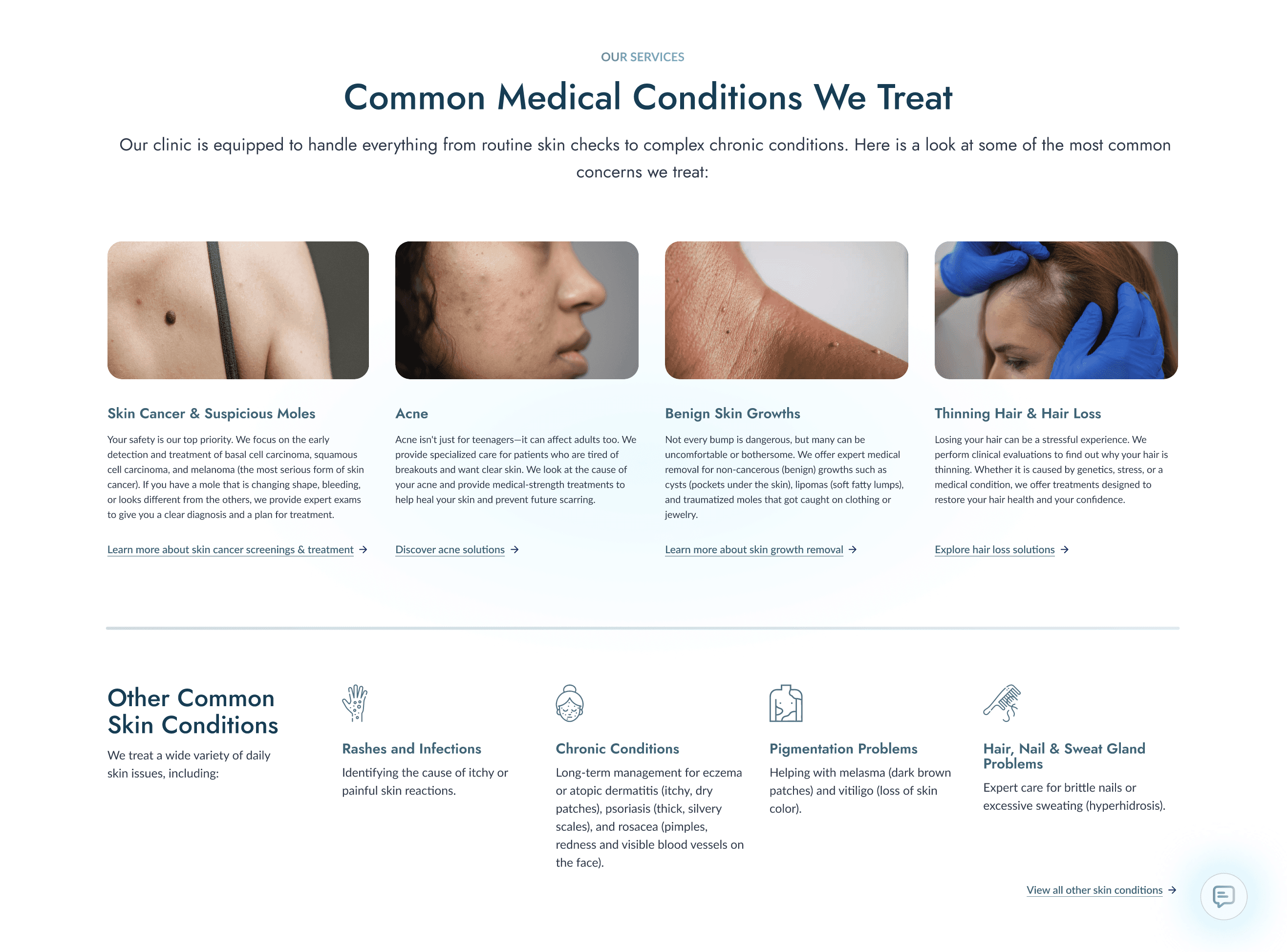
ITERATION
The final section: calmer lead imagery, with secondary conditions handled by icons and scannable copy.
It's the same principle as the CTA work, applied to imagery: more isn't clearer. The redesign trades exhaustiveness for the feeling the practice actually wants a patient to leave with: that you're in good hands.
Outcome & Targets
REDESIGN TARGETS CONVERSION
The redesign is currently in dev handoff, so live conversion data isn't in yet. But the work plugs directly into the engagement's defined targets, the service pages I designed are the top-priority, highest-leverage surfaces in a 16-page optimization roadmap. These are the baselines and goals it's designed to move:
16
Service pages prioritized for design & publish
82.7K ← 46K
Non-branded impressions target (from baseline)
479 ← 222
Non-branded clicks target (from baseline)
≥80 ← 73
AI sentiment score target (from baseline)
REFLECTIONS
What worked
Audit-first design changes what you argue about
Every review pointed back to a numbered finding, so debates were about evidence and not personal tastes.
Building the system from the brand was faster than from inspiration
Keeping turquoise and cutting purple gave instant cohesion without a rebrand.
"Show the work" has a ceiling
On the service page, the redesign initially showed too much. Spare some details to make the whole experience feel more digestible.
IF GIVEN MORE TIME…
Real patient testing
The partner-recoil was a sample of one; I'd validate the imagery choice with actual prospective patients.
A/B the CTA copy
"Schedule an Appointment" vs. "Book Online" is worth a real test once traffic is live.
Extend & document the system
…across all 16 service pages for clean dev handoff and future reuse.